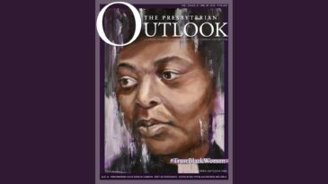
10 years ago — January 11, 2010
“The time has come to turn the page from a black and blue magazine … to … a high def, full color … magazine. … When first presented a copy of The Presbyterian Outlook, over 25 years ago, I didn’t contain my immediate impression. ‘Looks boring.’ It was printed entirely in black and white. It showcased zero pictures. My older, wiser ministerial colleague had handed this young, newly ordained upstart a copy of the weekly newsletter with the words, ‘You have a lot to learn about being Presbyterian. This is where you start.’ My reaction didn’t keep me from subscribing. Soon I was devouring it. A similar first impression has stopped many others in their tracks.” So started an editorial that announced the Outlook’s move into the second decade of the 21st century with a new look. The editor used the image of black/blue and full color to express the hope for the future of the PC(USA). His hope for the church was to leave behind the infighting and find a new appreciation for each other despite our differences. His prayer was for the full color of God’s love reflecting outward from our lives towards all — embracing all tones of skin color, young or old, straight or gay, male, female or transgender.
From the editorial “RIP, black and blue” by Jack Haberer